clip - 이미지/백그라운드 마스크 효과 주기
clip, background-clip을 사용하면 각각 이미지, 백그라운드에 마스크 효과를 줄 수 있다.
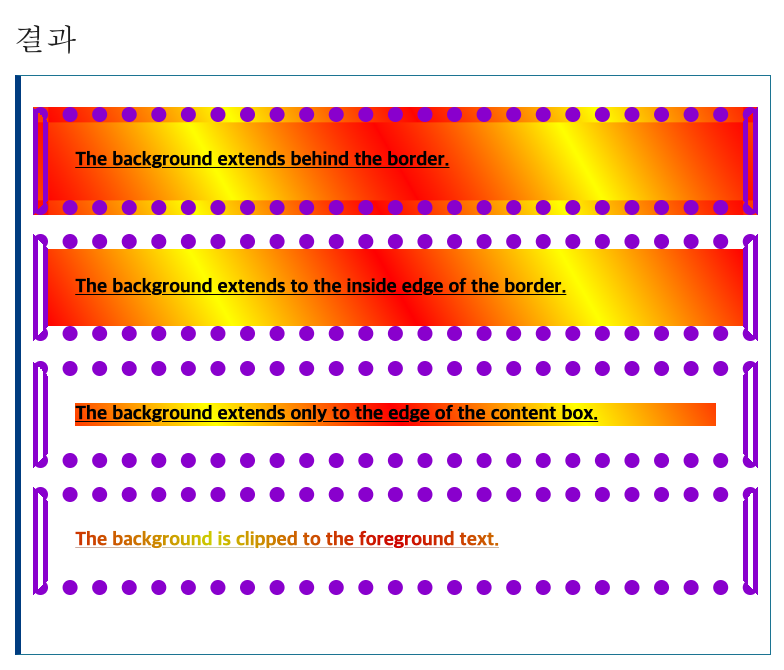
background-clip: border-box;: 배경이 테두리의 바깥 경계까지 차지합니다. (Z축 순서 상 테두리 아래 위치)background-clip: padding-box;: 배경이 안쪽 여백의 바깥 경계까지 차지합니다. 테두리 밑에는 배경을 그리지 않습니다.background-clip: content-box;: 배경을 콘텐츠 상자에 맞춰 그립니다.background-clip: text;: 배경을 전경 텍스트 위에만 그립니다. color를 설정해야 background가 나옵니다.
1
2
3
4
5
6
7
8
9
10
11
12
13
14
15
16
17
18
19
20
21
22
23
24
25
p {
  border: 0.8em darkviolet;
  border-style: dotted double;
  margin: 1em 0;
  padding: 1.4em;
  background: linear-gradient(60deg, red, yellow, red, yellow, red);
  font: 900 1.2em sans-serif;
  text-decoration: underline;
}

.border-box {
  background-clip: border-box;
}
.padding-box {
  background-clip: padding-box;
}
.content-box {
  background-clip: content-box;
}

.text {
  background-clip: text;
  -webkit-background-clip: text;
  color: rgba(0, 0, 0, 0.2);
}
background-clip
[CSS]GIF 이미지를 이용해서 클리핑 마스크 효과 나타내기
CSS속성 Clipping과 Masking 차이점과 특징
This post is licensed under CC BY 4.0 by the author.