[Pandas] Matplotlib 라이브러리로 그래프 그리기
Matplotlib
데이터를 그래프나 차트로 시각화 할 수 있는 라이브러리
그래프 그려보기
1
2
3
4
5
6
7
8
9
10
11
12
13
14
15
16
17
18
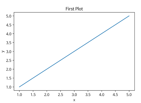
x = [1, 2, 3, 4, 5]
y = [1, 2, 3, 4, 5]
# 선 그리기
plt.plot(x, y)
# 그래프 제목 추가
plt.title("First Plot")
# x축 라벨 추가
plt.xlabel("x")
# y축 라벨 추가
plt.ylabel("y")
# 저장하기
fig.set_dip(300) # 해상도(보통 300 지정)
fig.savefig(”first_plot.png”) # 파일명 지정
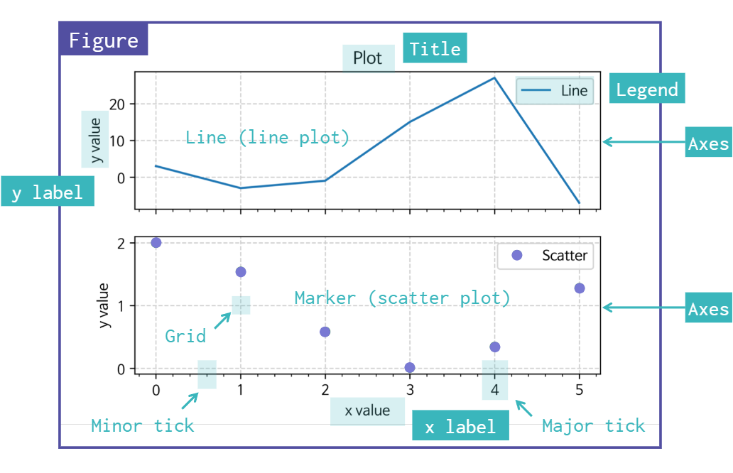
Matplotlib 그래프 구조
csv 파일 그래프화하기
Matplotlib with pandas
1
2
3
4
5
6
7
8
9
10
11
12
13
14
15
16
17
18
19
20
21
22
23
24
25
import numpy as np
import pandas as pd
import matplotlib.pyplot as plt

df = pd.read_csv("./data/pokemon.csv")

fire = df[
    (df['Type 1']=='Fire') | ((df['Type 2'])=="Fire")
]
water = df[
    (df['Type 1']=='Water') | ((df['Type 2'])=="Water")
]

fig, ax = plt.subplots()
ax.scatter(fire['Attack'], fire['Defense'],
    color='R', label='Fire', marker="*", s=50)
ax.scatter(water['Attack'], water['Defense'],
    color='B', label="Water", s=25)
ax.set_xlabel("Attack")
ax.set_ylabel("Defense")

# 라벨 표시
ax.legend(loc="upper right")

fig.savefig("plot.png")
This post is licensed under CC BY 4.0 by the author.