Google I/O State of CSS 2022
구글 I/O 개발자 컨퍼런스 CSS 부분 요약
color-mix
브라우저에서 색상을 혼합할 수 있고, 혼합 비율도 설정할 수 있다.
1
2
3
4
5
6
.color-mix-example {
  --brand: #0af;

  --darker: color-mix(var(--brand) 25%, black);
  --lighter: color-mix(var(--brand) 25%, white);
}
브랜드 컬러를 css 변수에 저장하고, black이나 white 색상을 섞어서 사용할 수 있다.
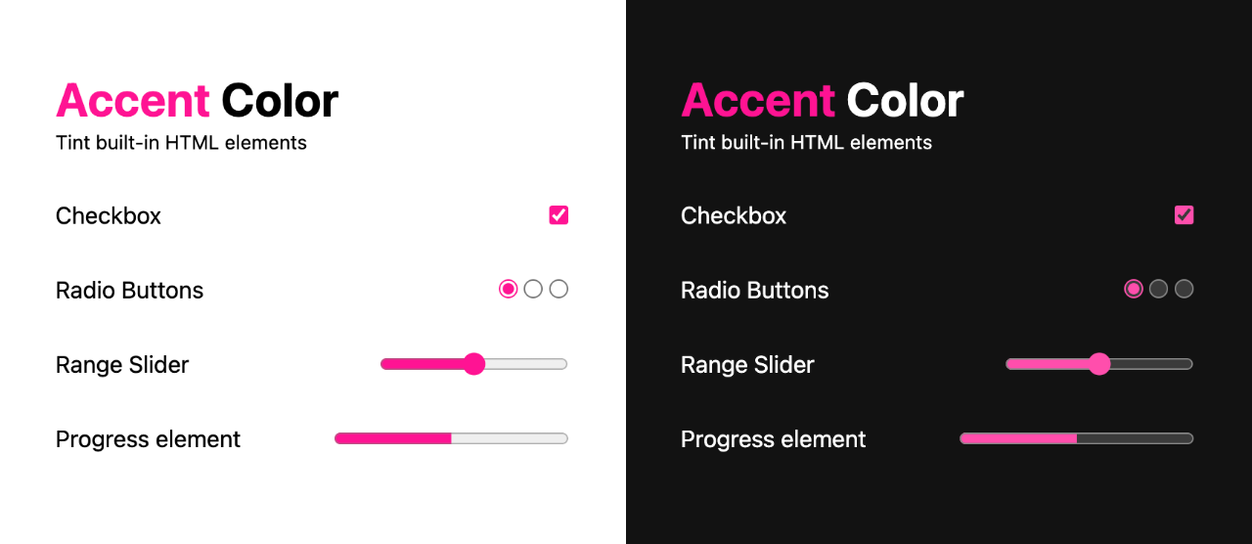
accent-color
스타일을 입힐 수 없었던 checkbox, radio, range, progress element HTML 요소를 커스터마이징 할 수 있다.
1
2
3
4
5
6
7
8
9
/* tint everything */
:root {
  accent-color: hotpink;
}

/* tint one element */
progress {
  accent-color: indigo;
}
color-scheme 속성과 같이 사용하면 다크 모드, 라이트 모드를 감지하여 기본 요소들을 지능적으로 렌더링하기에 편안한 색상으로 조정한다.
1
2
3
4
:root {
  color-scheme: dark light;
  accent-color: hotpink;
}
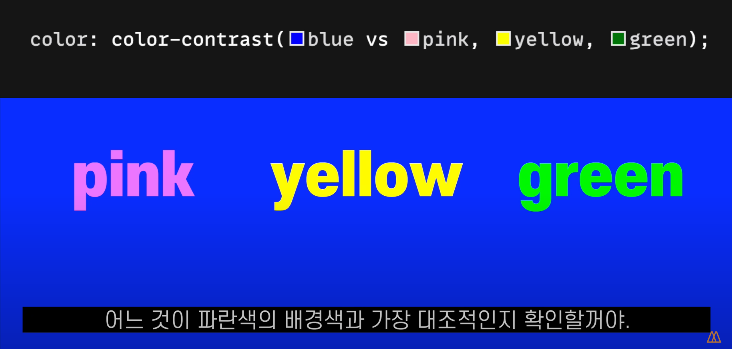
color-contrast
입력한 배경색과 가장 대비되는 색상을 자동으로 골라 표시한다.
기본적으로 검정 또는 흰색 중에서 골라주며, 혹은 색상 리스트를 입력하여 그 중에서 고르게 할 수도 있다.
1
2
3
color: color-contrast(gray);

color: color-contrast(gray vs indigo, rebeccapurple, hotpink);
inert
노드를 비활성화 시키는 HTML 속성.
스크린 리더기에서 건너뛰거나, 포커스나 클릭 등의 이벤트에서 제외할 때 유용하다.
inert 속성을 넣으면 요소는 마치 비활성화 된 것 처럼 freeze 된다.
1
2
3
4
5
6
<html>
  <form inert>
    <input type="text" />
    <button>Button</button>
  </form>
</html>
:has()
드디어.. 특정한 하위 요소를 가진 부모 요소에 css를 적용할 수 있다!
1
2
3
4
5
6
7
8
9
10
11
12
13
14
15
.parent:has(.child) {
  ...;
}

section:has(*:focus-visible) {
  ...;
}

a:has(> img) {
  ...;
}

form:has(button:hover) {
  ...;
}
브라우저가 :has() 셀렉터를 지원하는 지 체크하여 사용할 수 있다.
1
2
3
@supports (selector(:has(works))) {
  /* safe to use :has() */
}
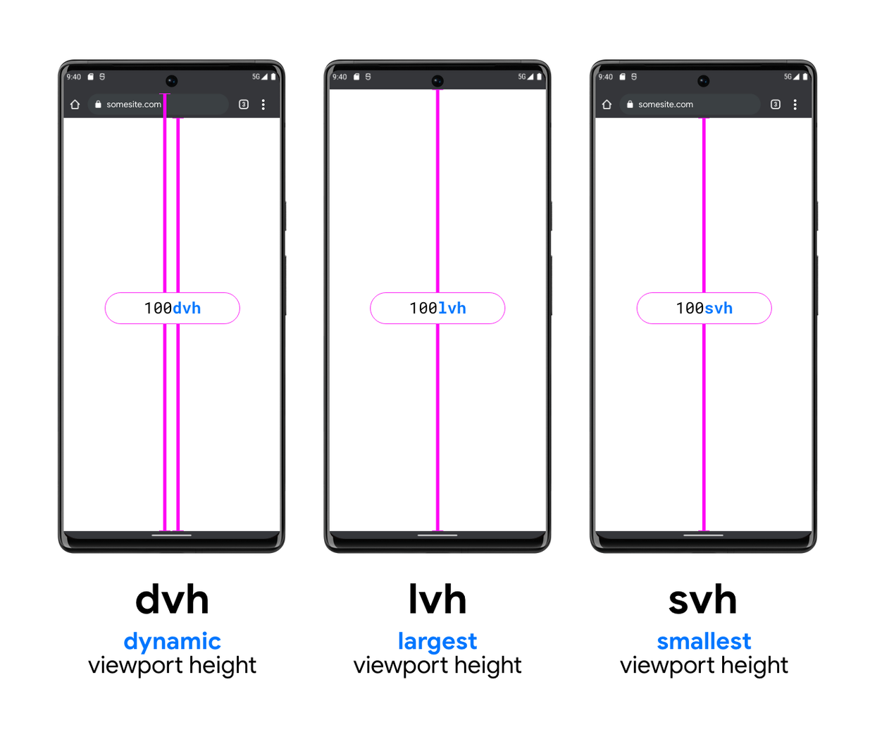
Viewport units
모바일에서 주소창이나 상태바 등을 포함한 최대, 최소 높이와 너비를 구할 수 있다.
1
2
3
4
5
6
7
8
9
width: 100vw;
width: 100dvw;
width: 100svw;
width: 100lvw;

height: 100vh;
height: 100dvh;
height: 100svh;
height: 100lvh;
@nest
전처리기의 &를 이용한 중첩 기능을 CSS에서도 사용할 수 있게 되었다.
@nest를 사용하면 하나의 스타일 블록 내에서 셀렉터나 자식 요소의 스타일을 지정할 수 있다.
1
2
3
4
5
6
7
8
9
10
11
12
13
14
15
16
17
article {
  color: darkgray;
}

article > a {
  color: var(--link-color);
}

/* with @nest becomes */

article {
  color: darkgray;

  & > a {
    color: var(--link-color);
  }
}
또한 자식에서 부모 요소로 접근할 수도 있다.
1
2
3
4
5
6
7
8
9
10
11
12
13
/* parent owns this, adjusting children */
section:focus-within > article {
  border: 1px solid hotpink;
}

/* with @nest becomes */

/* article owns this, adjusting itself when inside a section:focus-within */
article {
  @nest section:focus-within > & {
    border: 1px solid hotpink;
  }
}
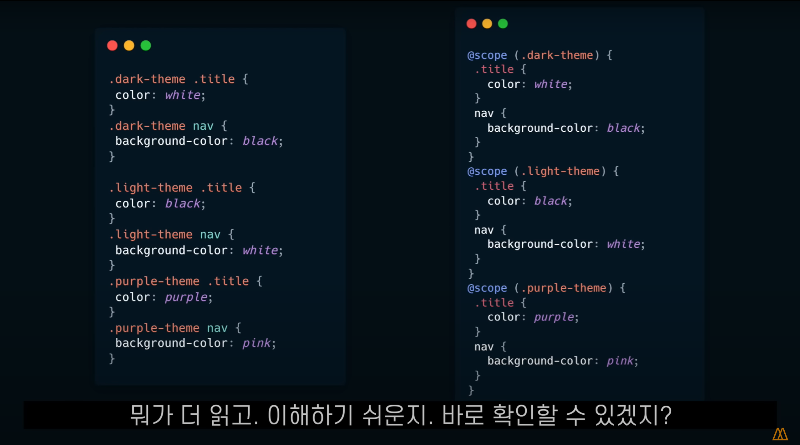
@scope
클래스와 같은 컨텍스트 내에서 스타일의 범위와, 스타일이 끝나는 위치를 지정할 수 있다.
1
2
3
4
5
6
7
8
9
@scope (.media-block) to (.content) {
  img {
    border-radius: 50%;
  }

  .content {
    padding: 1em;
  }
}
위 예제에서 img 및 .content 스타일은 .media-block의 자식이 .content의 형제 또는 부모일 때 적용된다.
@container
페이지의 전체 영역 크기가 아니라 특정 컨테이너 요소의 크기에 따라 미디어 쿼리를 적용할 수 있다.
컨테이너를 쿼리 대상으로 선언한 후 컨테이너의 크기를 쿼리하여 사용한다.
1
2
3
4
5
6
7
8
9
10
11
12
13
14
15
16
17
/* 선언 */
.day {
  container-type: inline-size;
  container-name: calendar-day;
}

/* 사용 */
@container calendar-day (max-width: 200px) {
  .date {
    display: block;
  }

  .date-num {
    font-size: 2.5rem;
    display: block;
  }
}
custom-media
미디어 쿼리를 변수로 만들어 사용할 수 있다.
@custom-media + 변수명 + 쿼리를 입력하여 만들 수 있다.
1
2
3
4
5
6
7
8
9
10
11
12
13
14
15
16
/* 선언 */
@custom-media --OSdark (prefers-color-scheme: dark);
@custom-media --OSlight (prefers-color-scheme: light);

@custom-media --pointer (hover) and (pointer: coarse);
@custom-media --mouse (hover) and (pointer: fine);

@custom-media --xxs-and-above (width >= 240px);
@custom-media --xxs-and-below (width <= 240px);

/* 사용 */
@media (--OSdark) {
  :root {
    …
  }
}