CSS cubic-bezier() Function
cubic-bezier(x1, y1, x2, y2)
x1, y1, x2, y2 4개의 점으로 3차원 베지어 곡선을 그리는 css 함수.
1
2
3
4
5
6
7
div {
  width: 100px;
  height: 100px;
  background: red;
  transition: width 2s;
  transition-timing-function: cubic-bezier(0.1, 0.7, 1, 0.1);
}
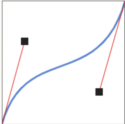
위 그림에서 두 검은 점의 위치([x1, y1] 과 [x2, y2])를 옮겨서 애니메이션 곡선을 만들 수 있다.
곡선 만들기는 이 사이트에서 테스트 해볼 수 있다.
참고사이트
CSS transition cubic-bezier를 파헤치기.
CSS cubic-bezier() Function
This post is licensed under CC BY 4.0 by the author.